Blu Dot Showroom
Location:
Portland, Oregon
Type:
Mixed-Use / Retail
Size:
7,300 sf
Owner:
Blu Dot
Contractor:
R & H Construction
Photographer:
Jeremy Bittermann
Status:
Completed December 2019
Awards:
︎︎︎ 2021 Gray Awards, Commercial Architecture; Winner
︎︎︎ 2021 Dezeen Awards, Large Retail Interior Category; Longlist
︎︎︎ 2020 Daily Journal of Commerce, Top Projects Award; Third Place
︎︎︎ 2020 Architects Newspaper Best of Design Awards; Honorable Mention
︎︎︎ 2020 AIA Oregon Architecture Awards; Citation Award
︎︎︎ 2020 AIA NW + Pacific Region Awards; Merit Award
Press:
︎︎︎ 2020 Azure
︎︎︎ 2020 Metropolis
︎︎︎ 2020 Business Tribune
︎︎︎ 2020 The Oregonian
︎︎︎ 2019 Business of Home
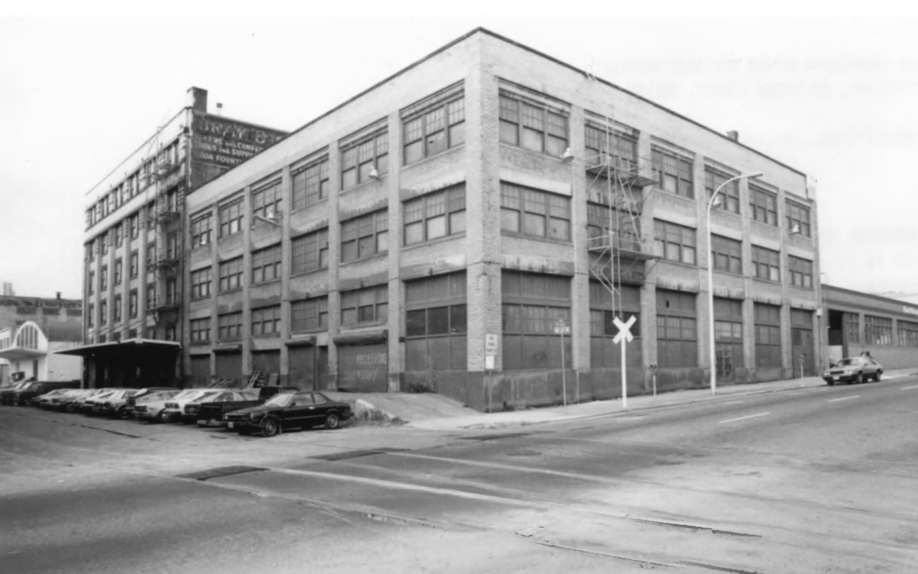
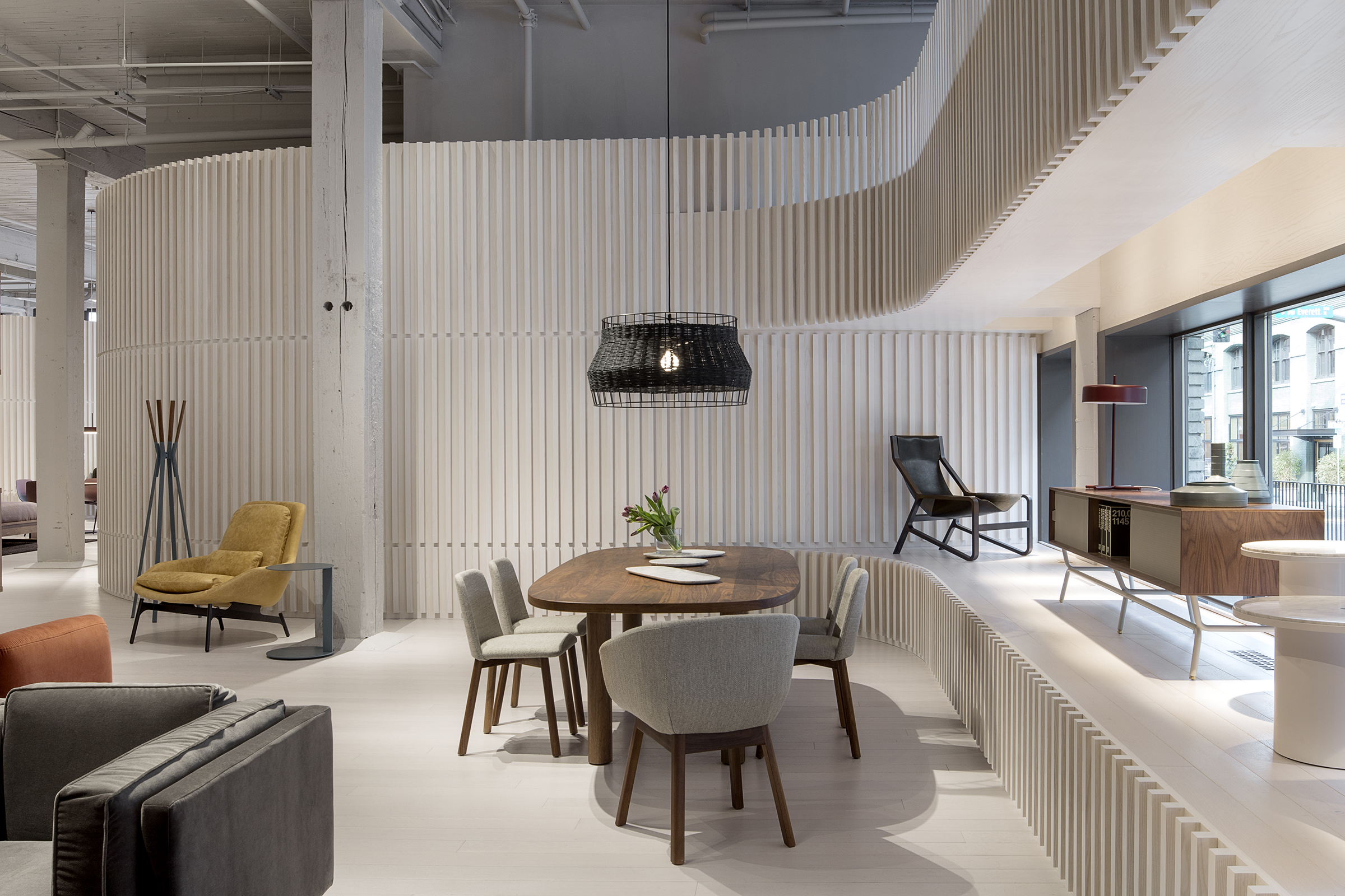
This showroom in Portland’s Pearl District highlights the character and quality of the furniture company Blu Dot. Built within a historic warehouse, the project was designed to preserve the spirit of the original industrial building, while introducing a newly crafted intervention as a showroom environment.
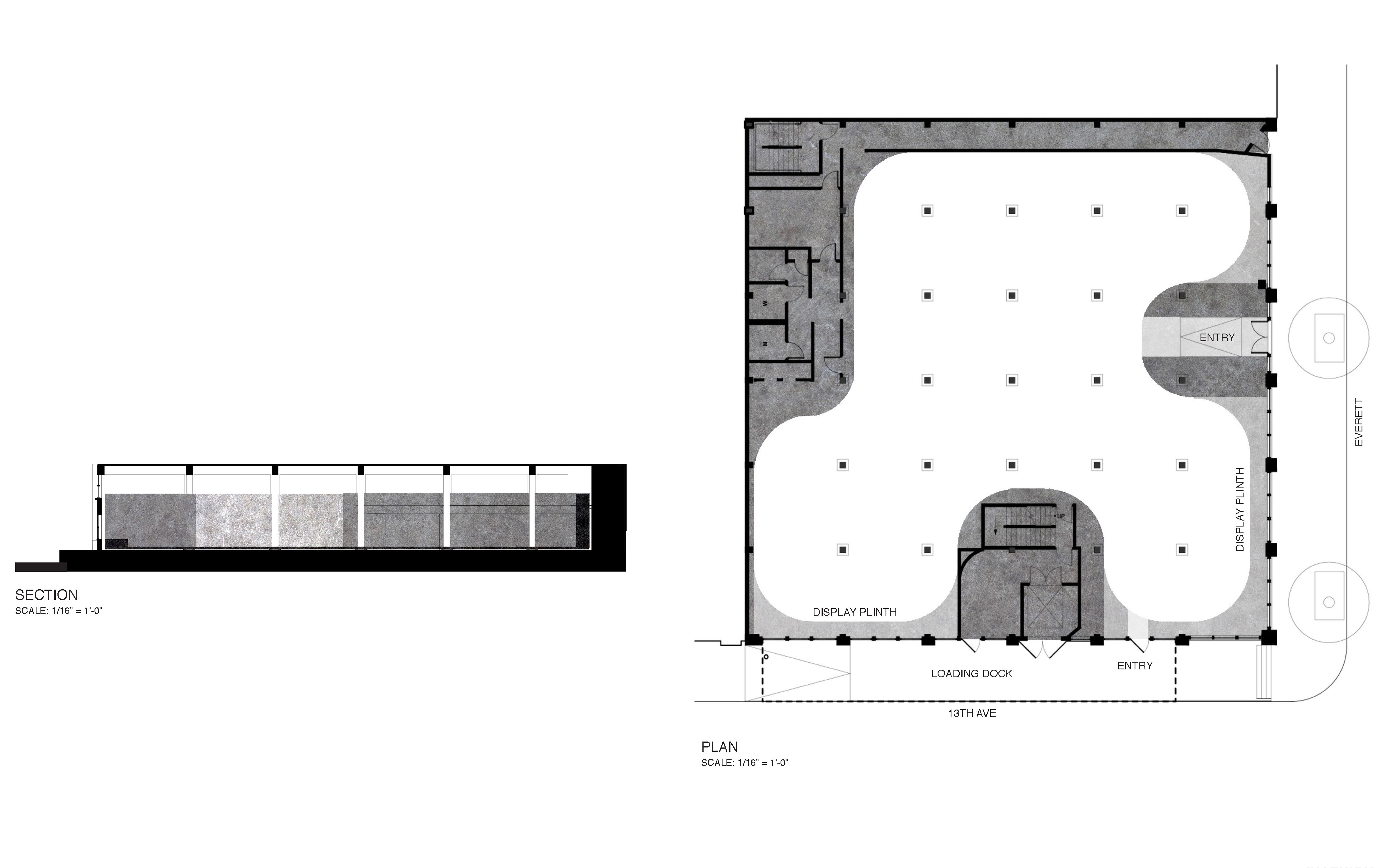
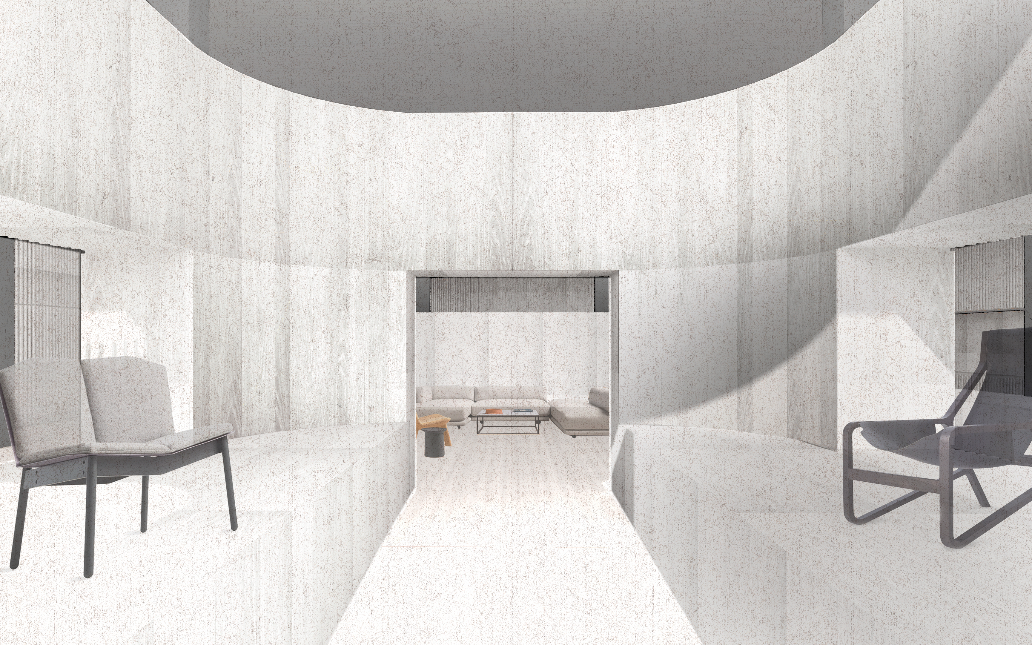
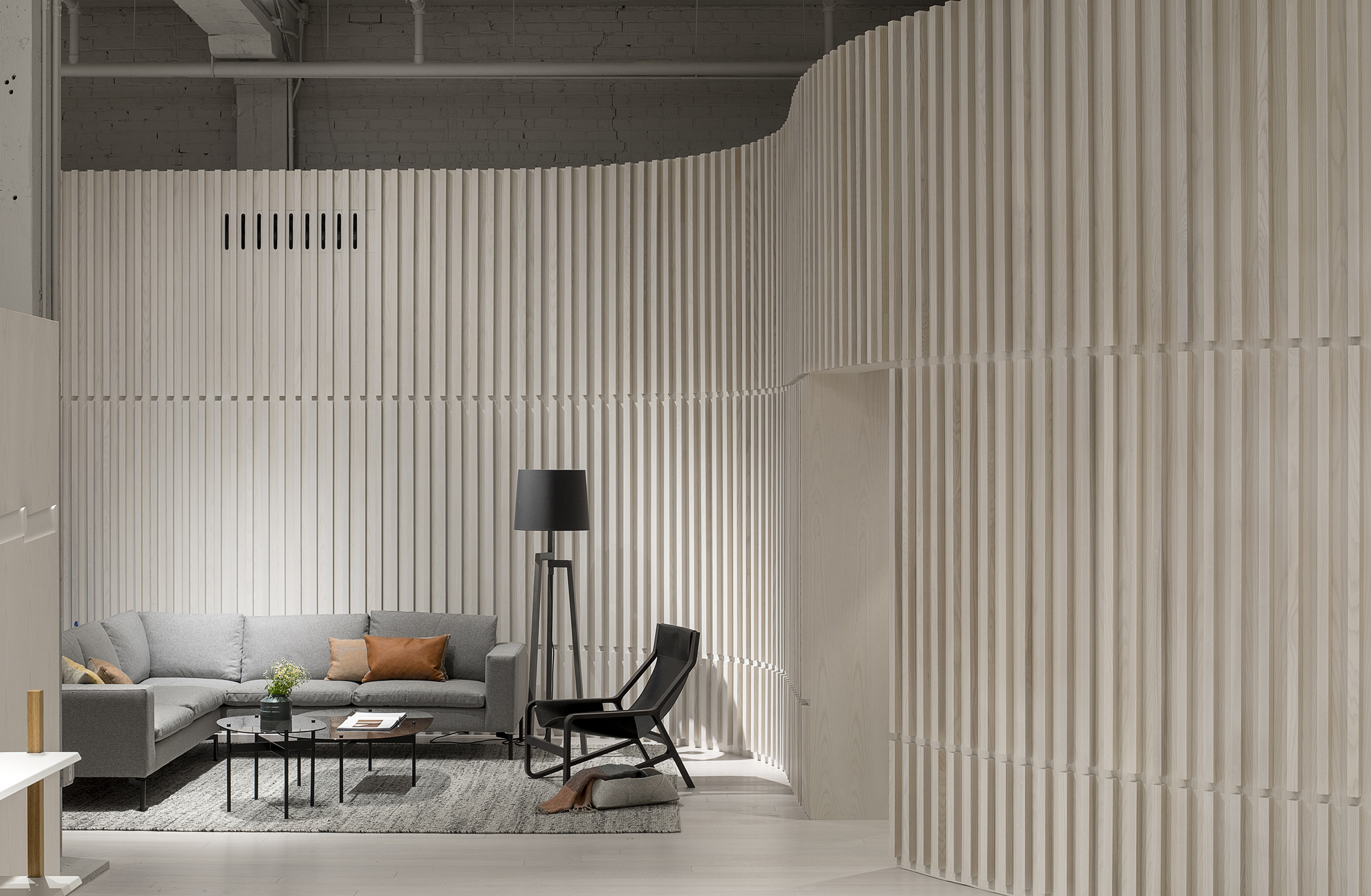
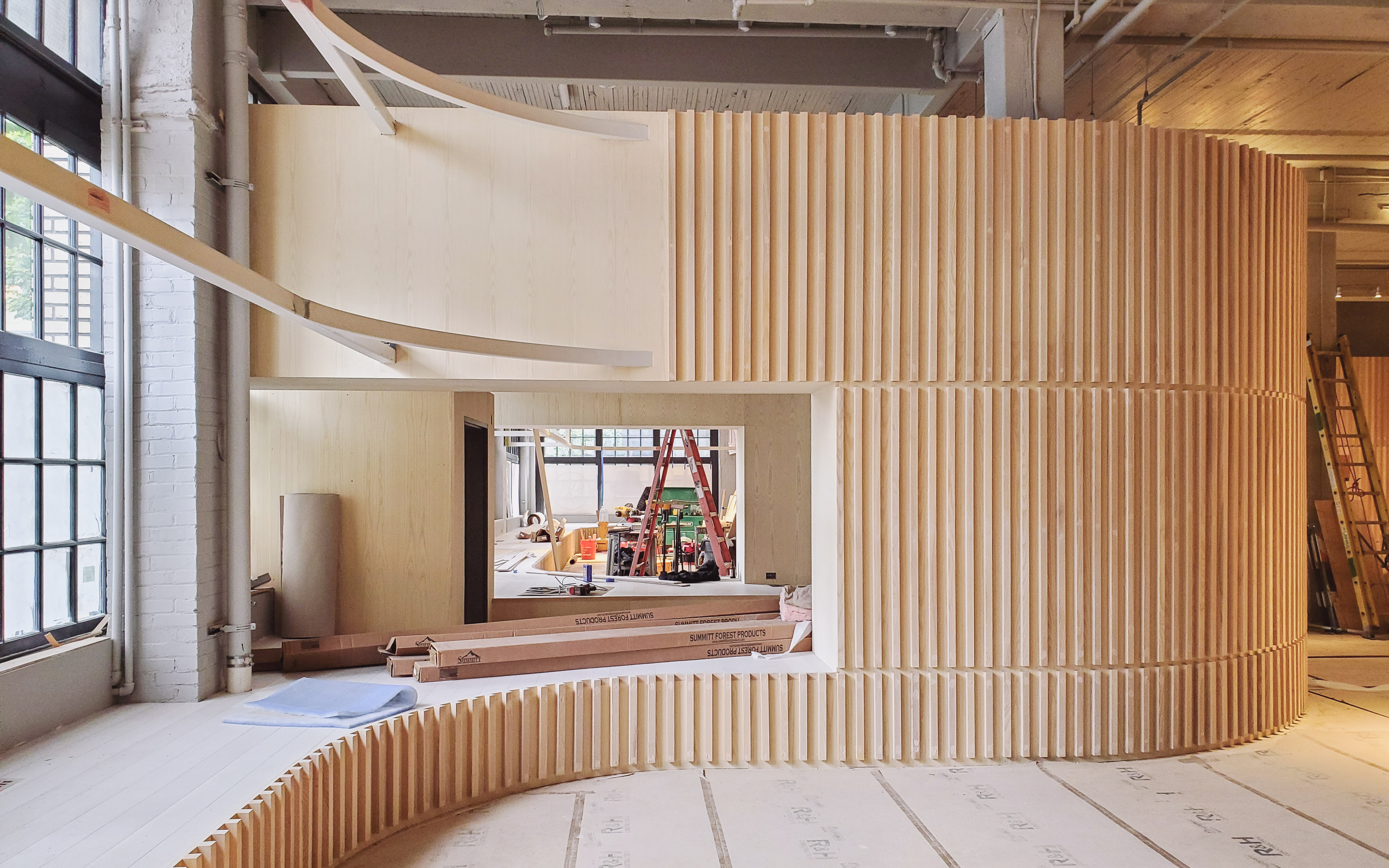
Envisioned as a crafted object inserted into the building, the intervention sits within the space, set apart from the existing structural frame. With a white-washed wood finish that carries from floor to wall, the character of this new form is distinct from, yet in dialogue with the textures and construction of the old warehouse and new furniture throughout.
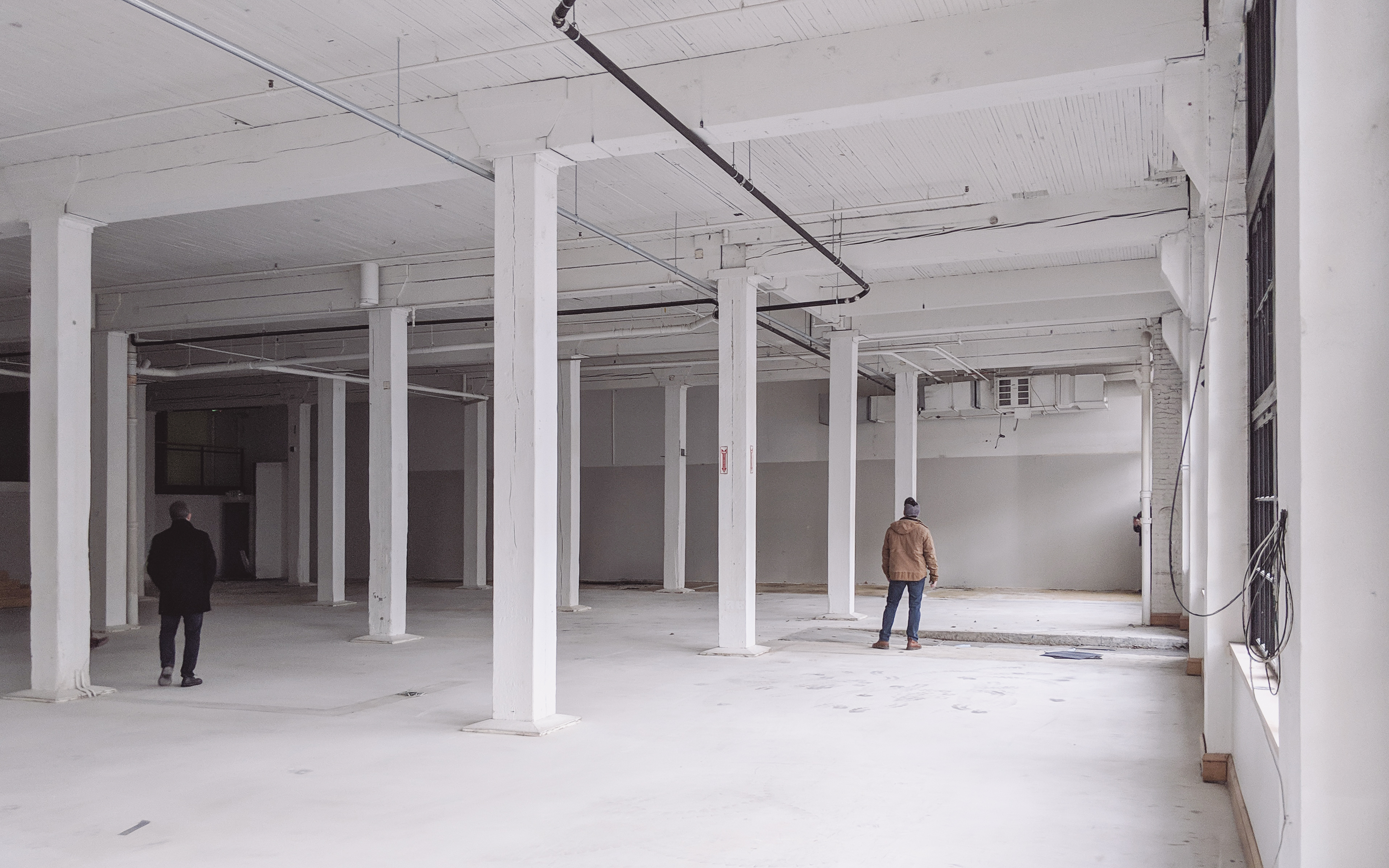
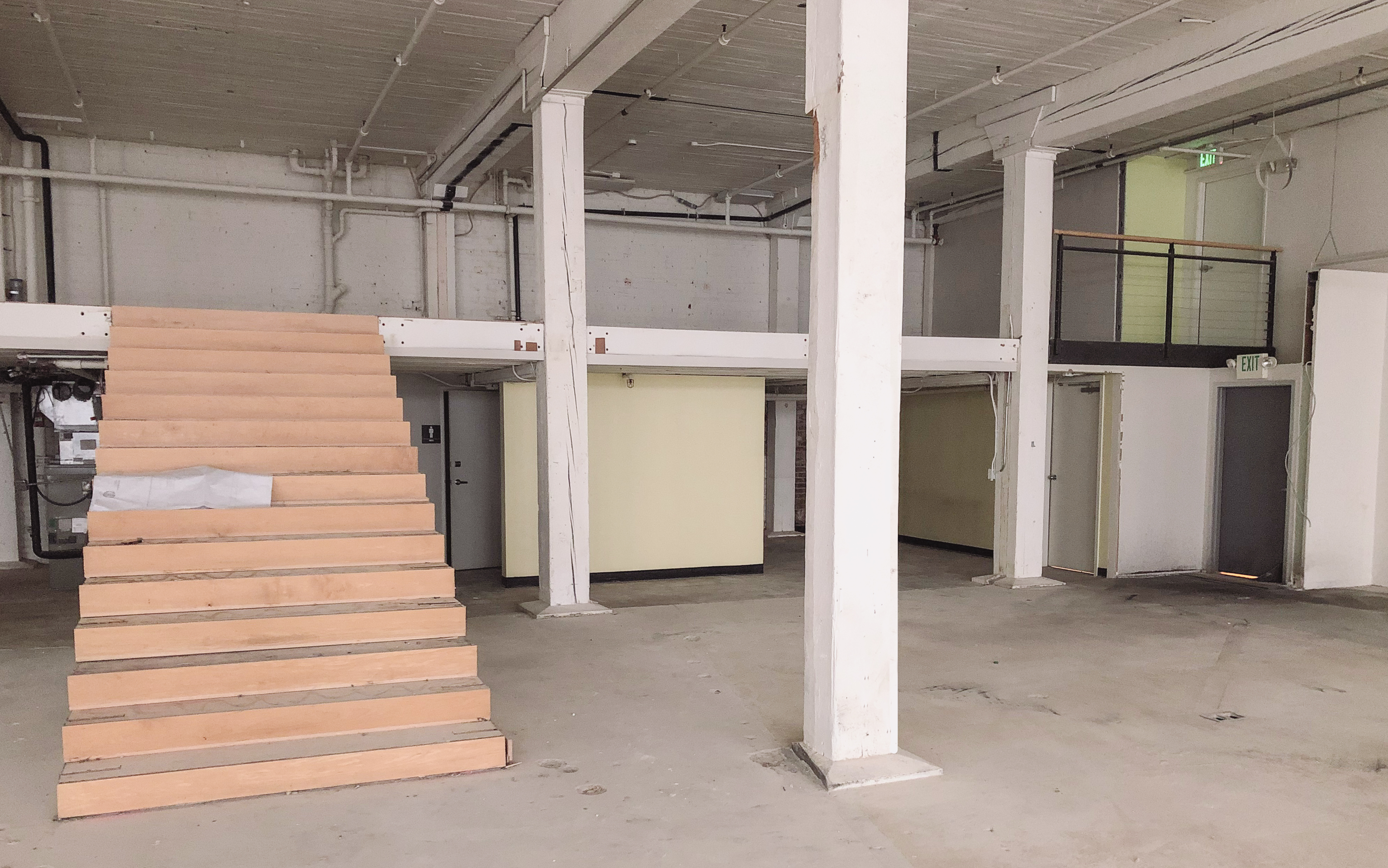
The existing space was a mixture of historic features and an eclectic set of additions. While the building had a clear organization of a pre-war warehouse structure, a series of renovations divided the interior space and disrupted its logic. Rather than compete with the old, our intervention instead works in concert with the building structure, strategically creating elements that bring the original framework to light.
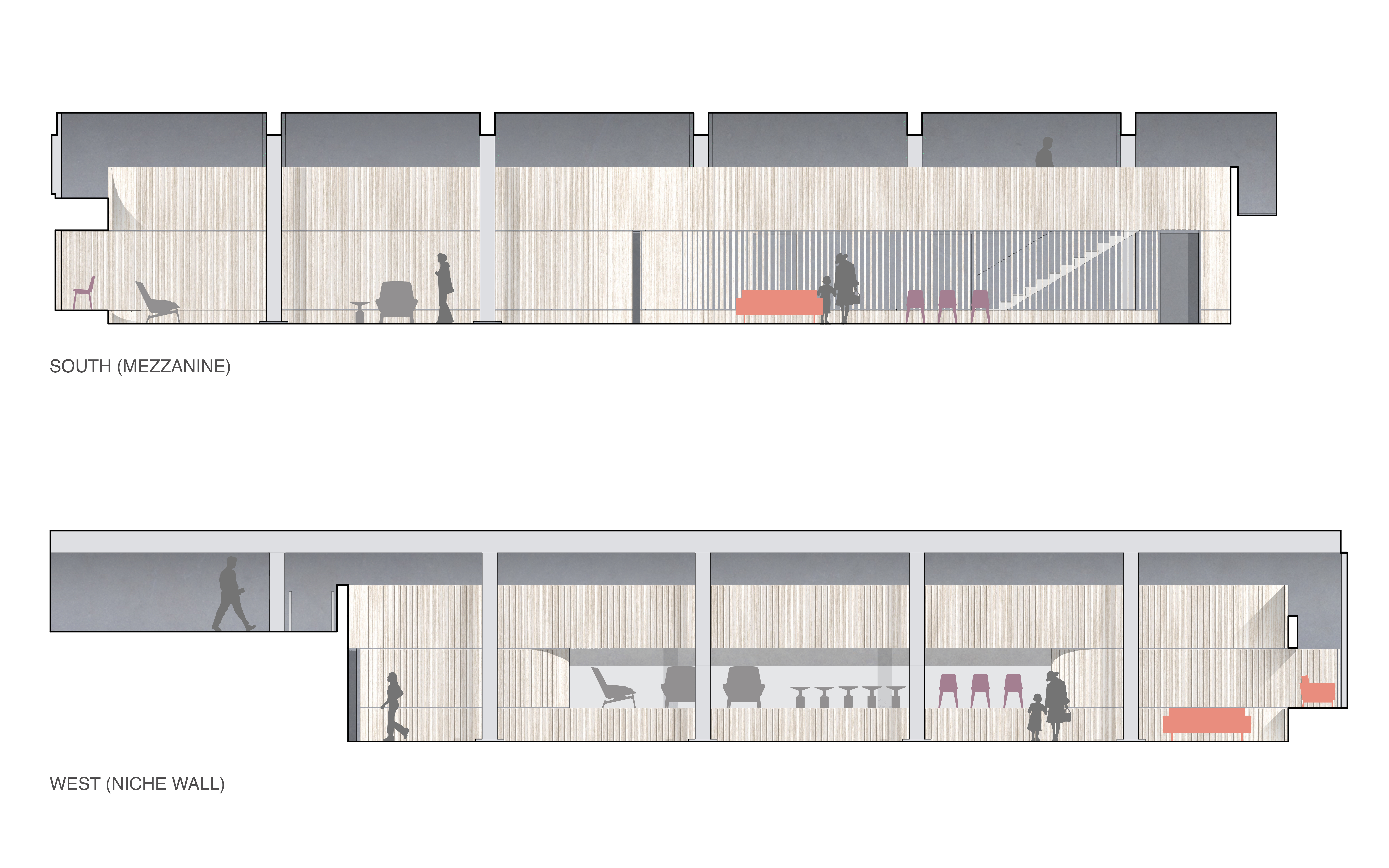
To reveal the old structure, an existing mezzanine was minimized to allow daylight in. A wing of individual offices was removed and infilled bays against the outer walls were opened up for additional visibility.
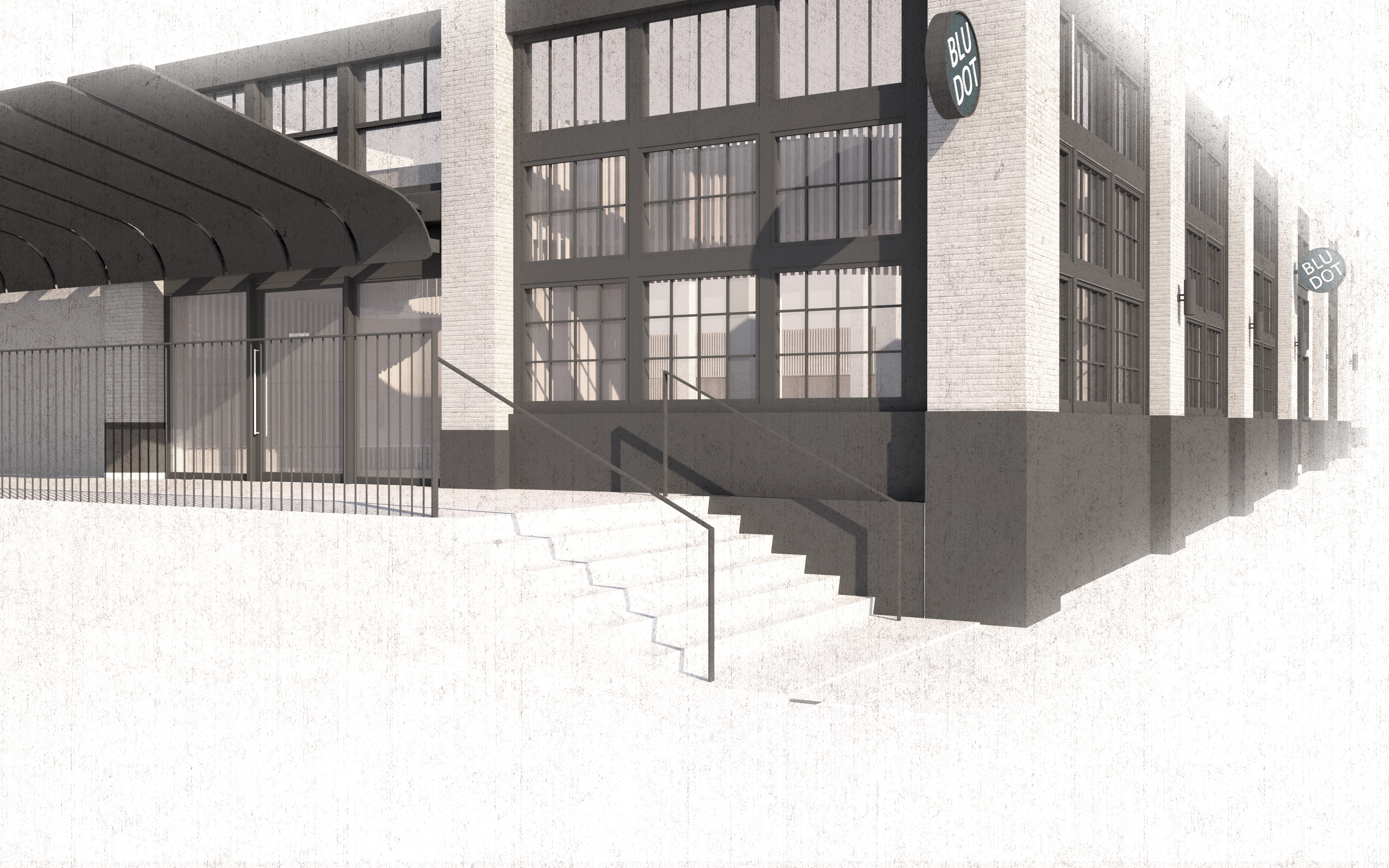
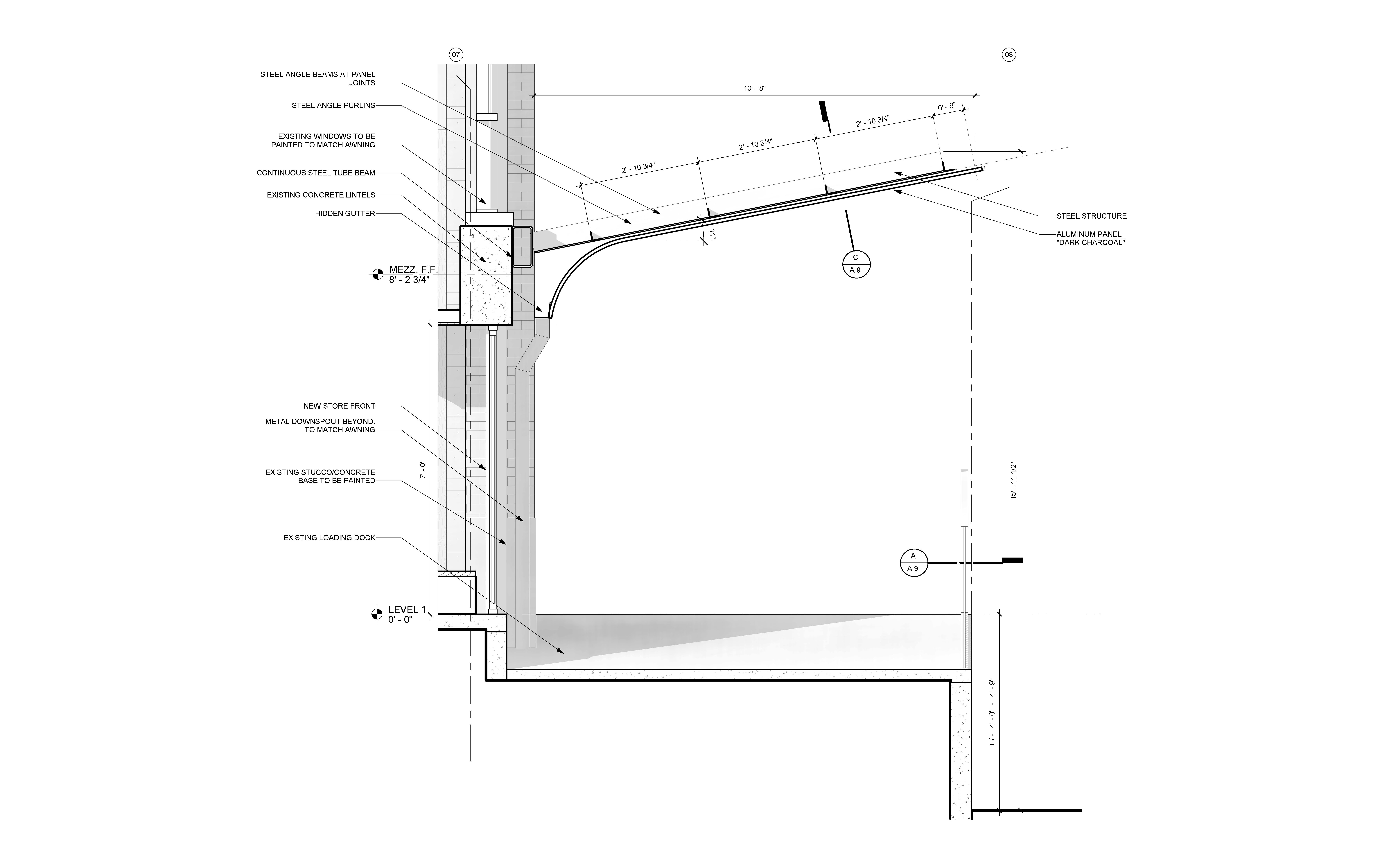
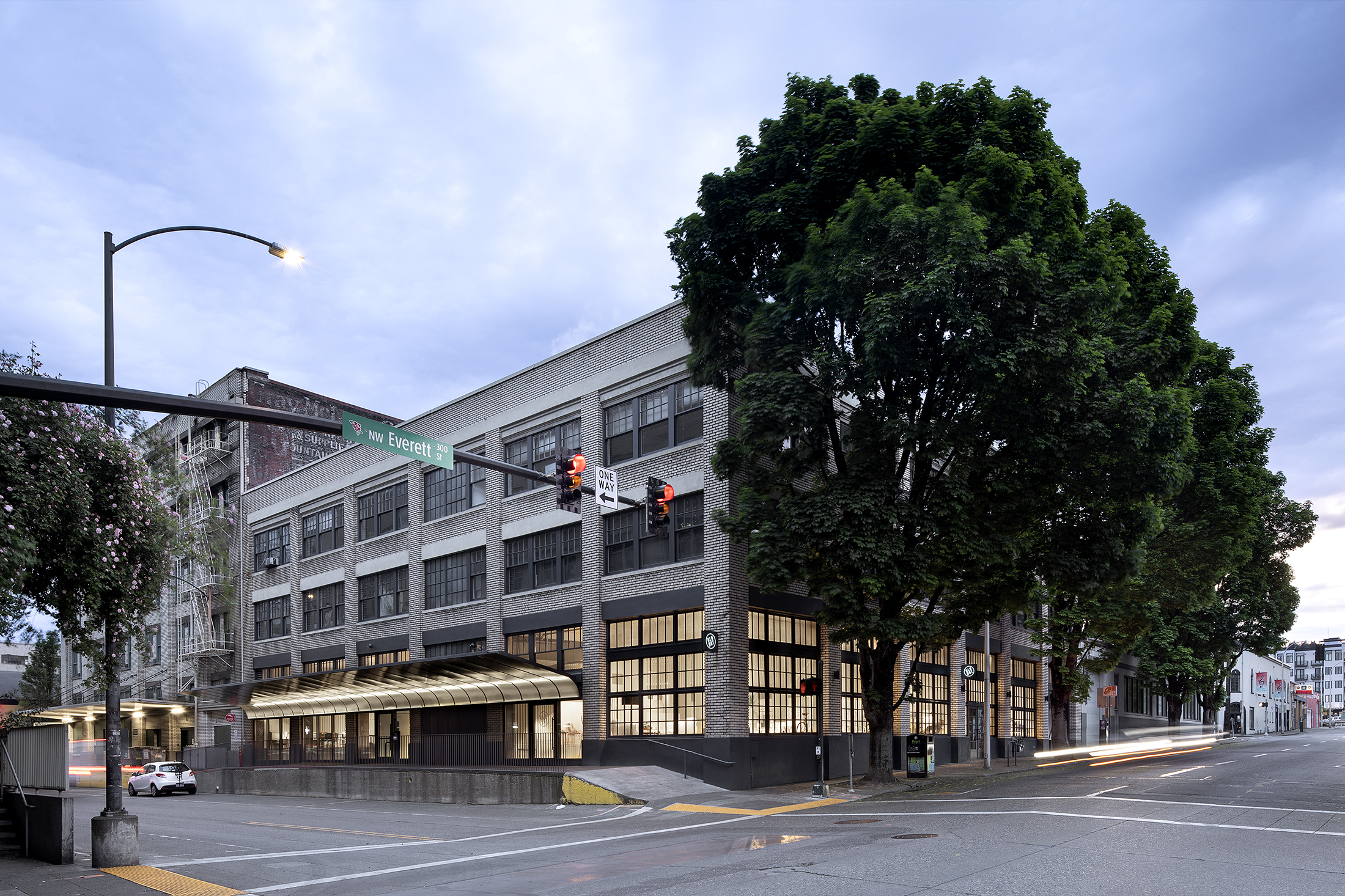
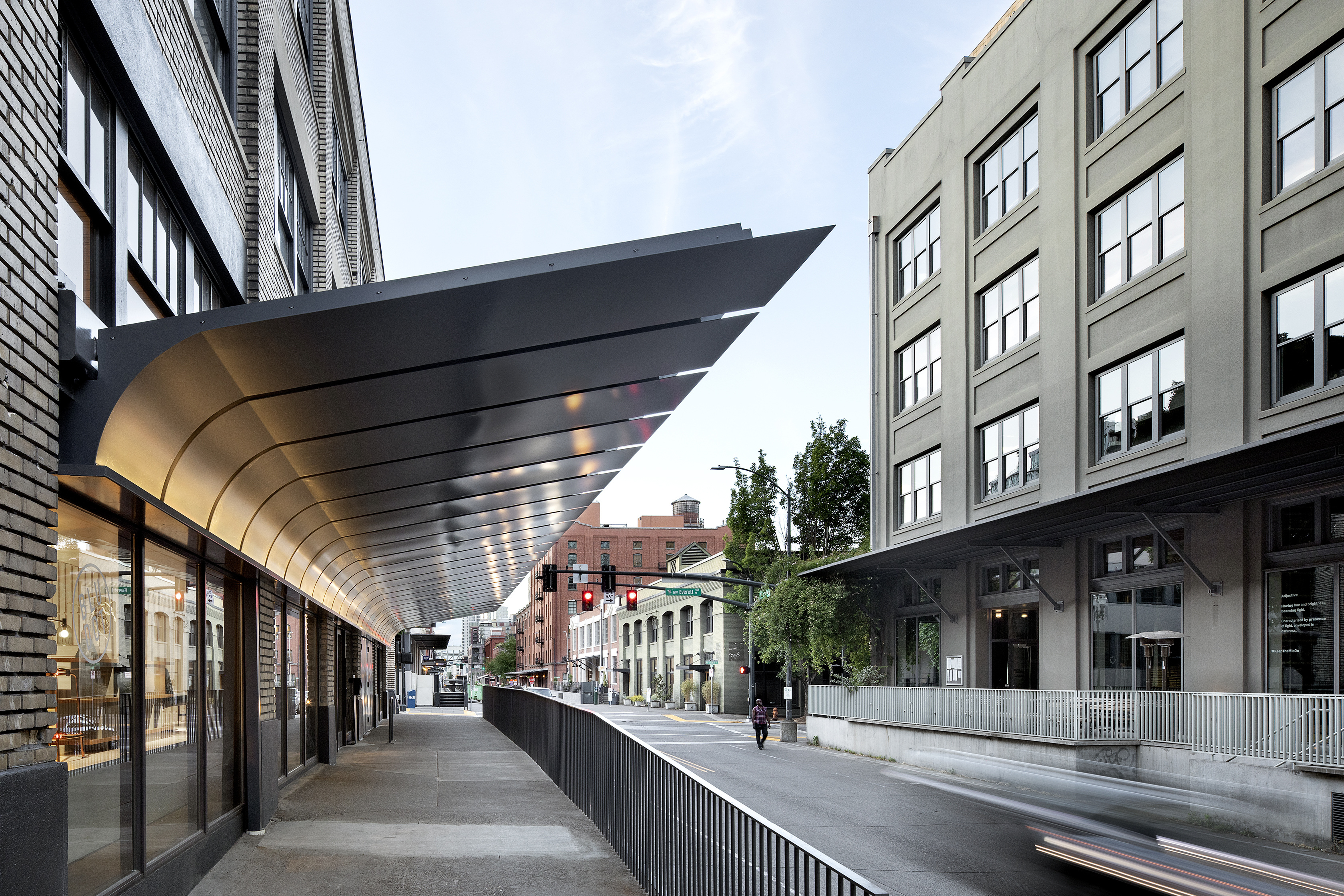
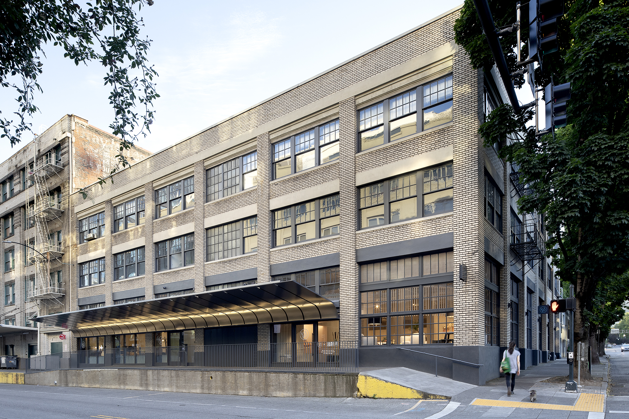
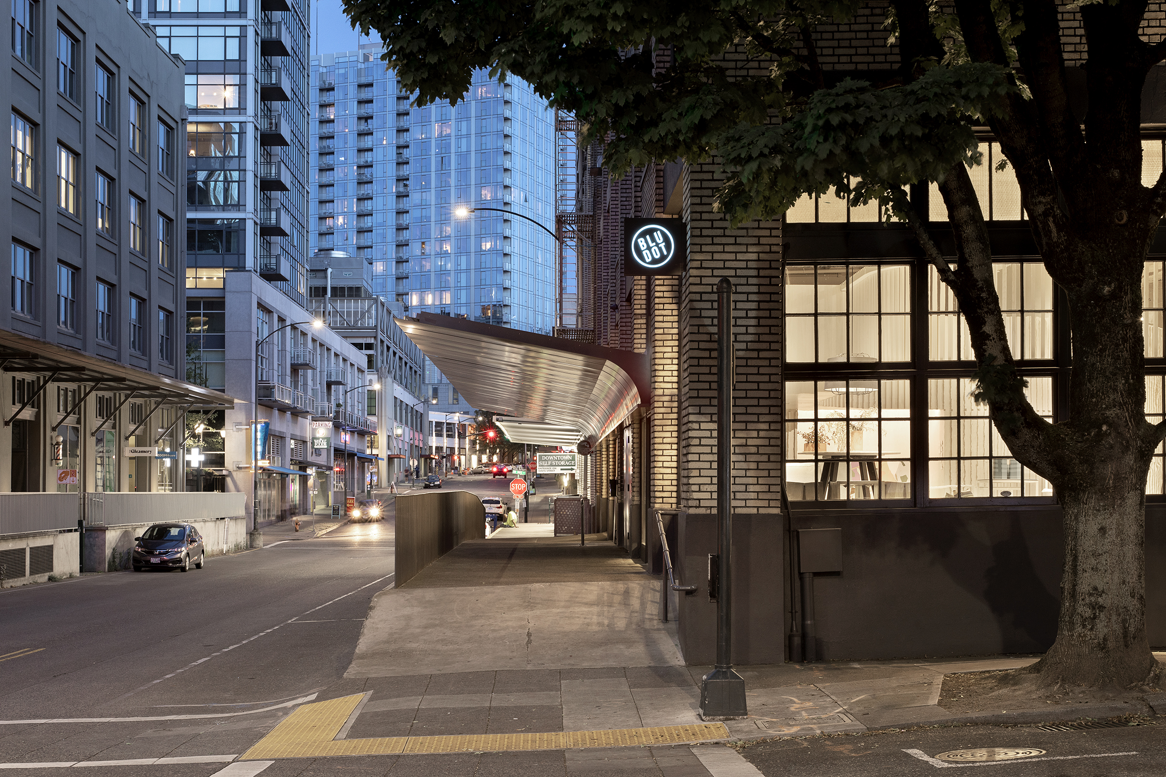
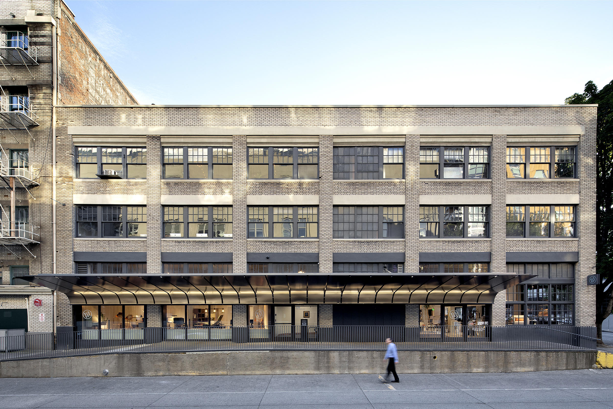
On the building exterior, a new canopy brings storefront, loading areas, and elevator access bays into a singular form and organization. The canopy takes on its own identity, curving downward against the brick facade to frame the new entry to the interior. New wood storefronts sit at the base of the canopy and mark the scope of the intervention. The result is a singular gesture that highlights both the new and the old.
Taken together, the interior and exterior interventions redefine the space and the building's identity as a complete whole. The result is a showroom where the architecture is evident in concept, form, and detail, yet acts as a textured backdrop for the primary furniture and objects on display.
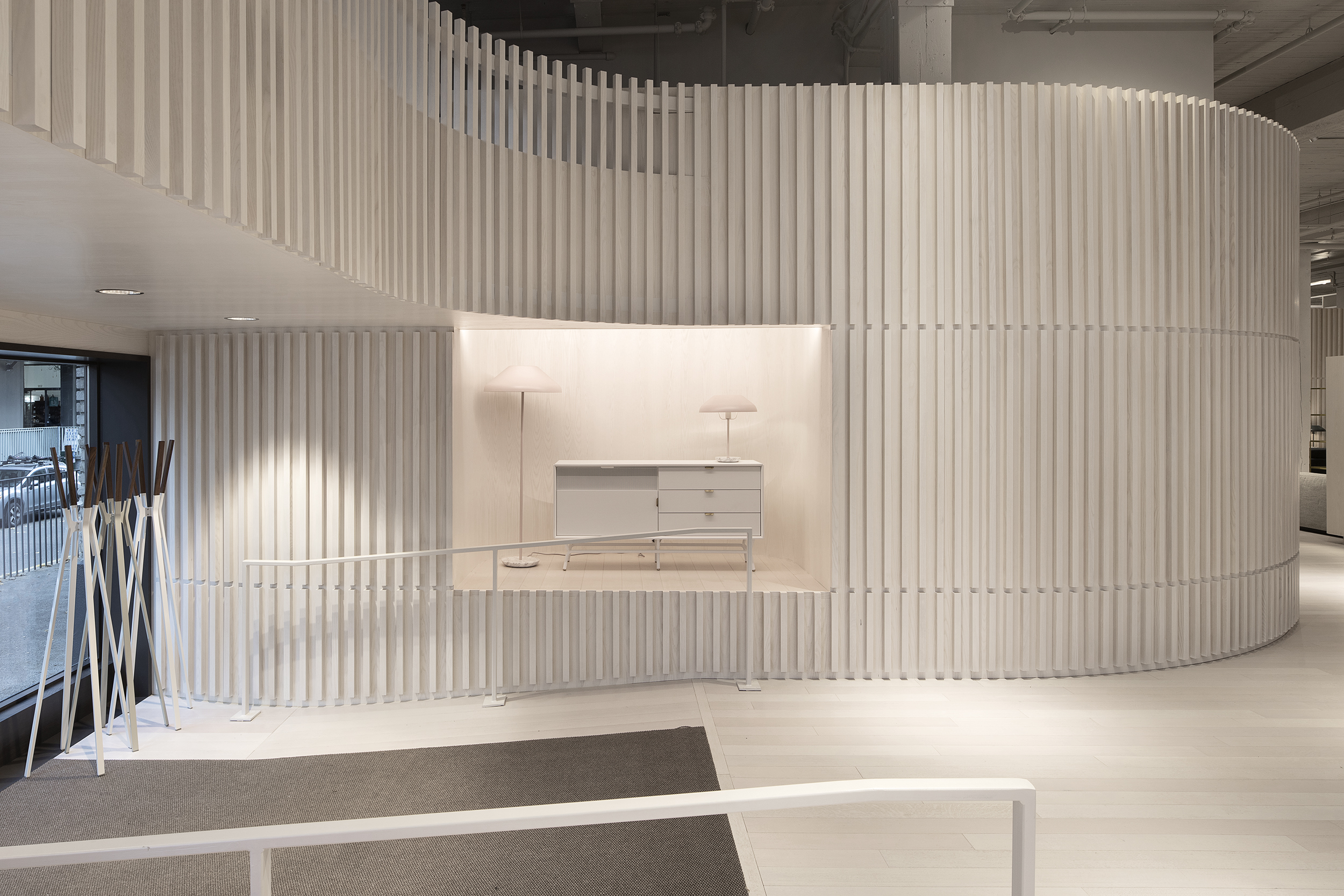

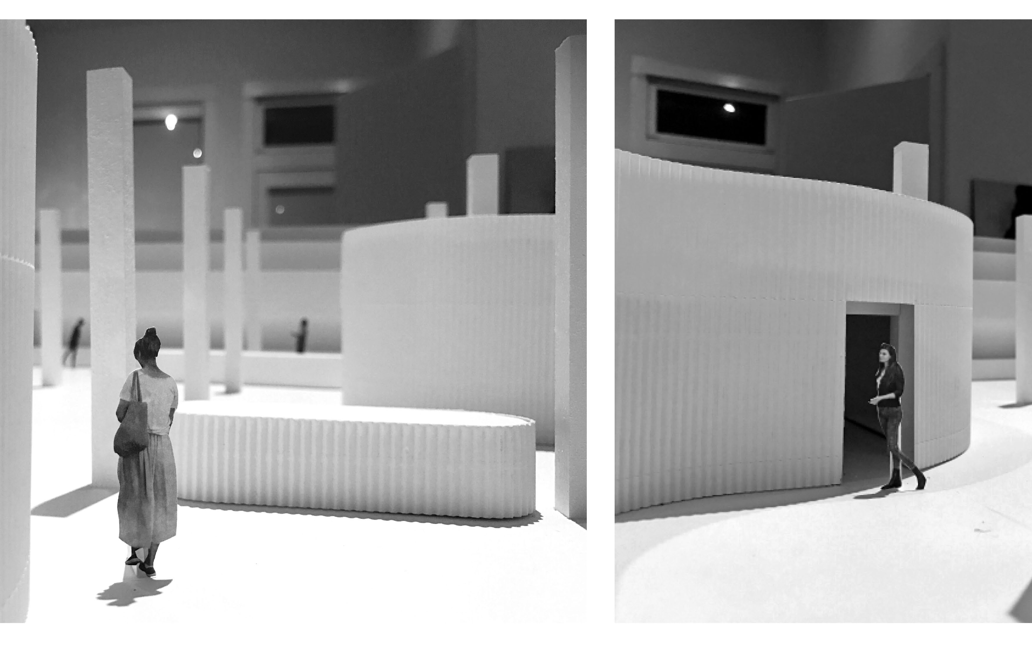
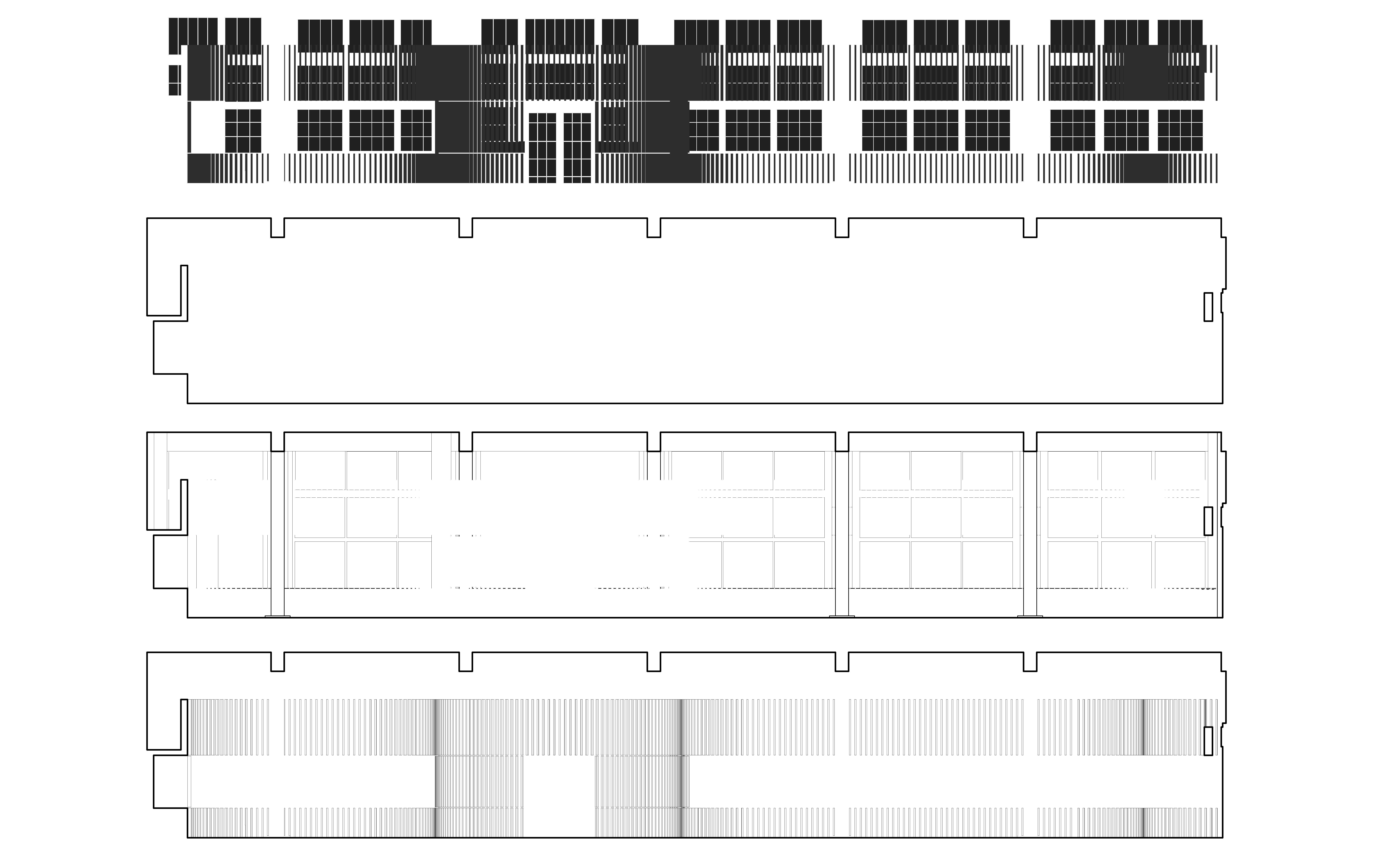
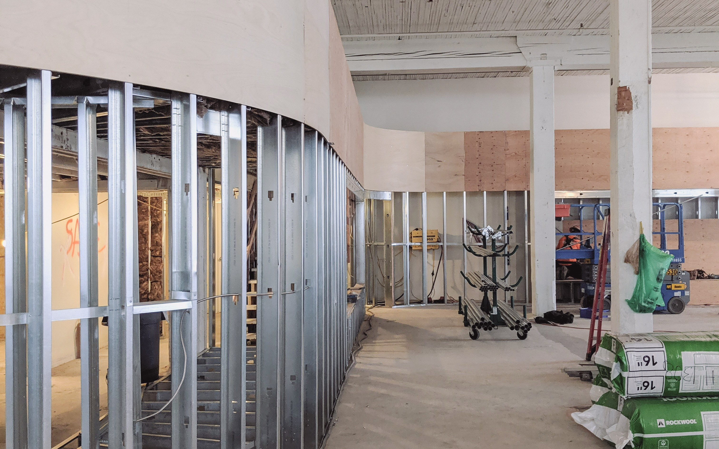
Lined with wood battens, the curving walls take on a highly-crafted texture. Three horizontal break lines in the battens track key heights as they move through the space, denoting display plinths, door thresholds, and the mezzanine guard rails. Display areas and storage are further incorporated into their thickness, as are venting and mechanical systems.
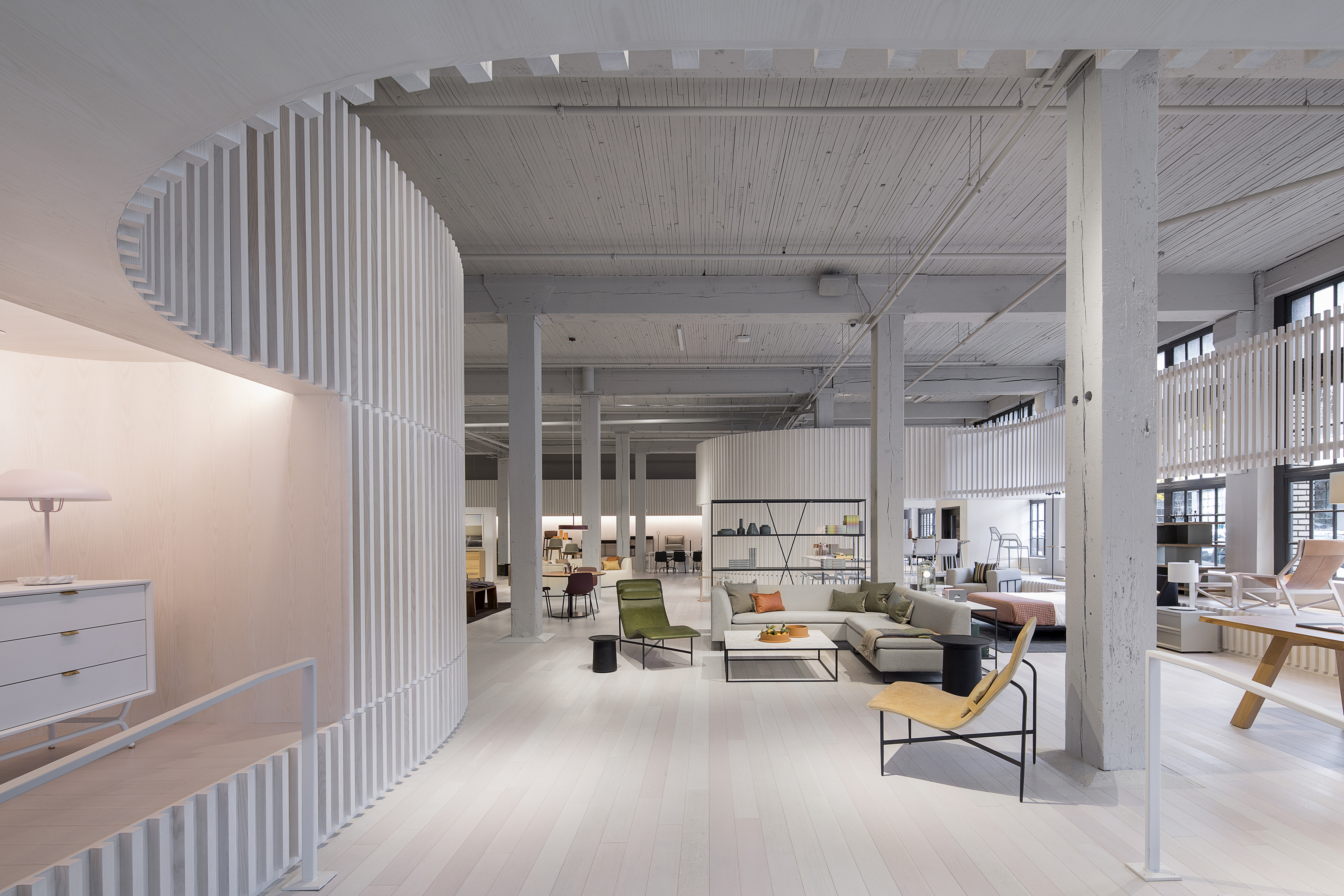
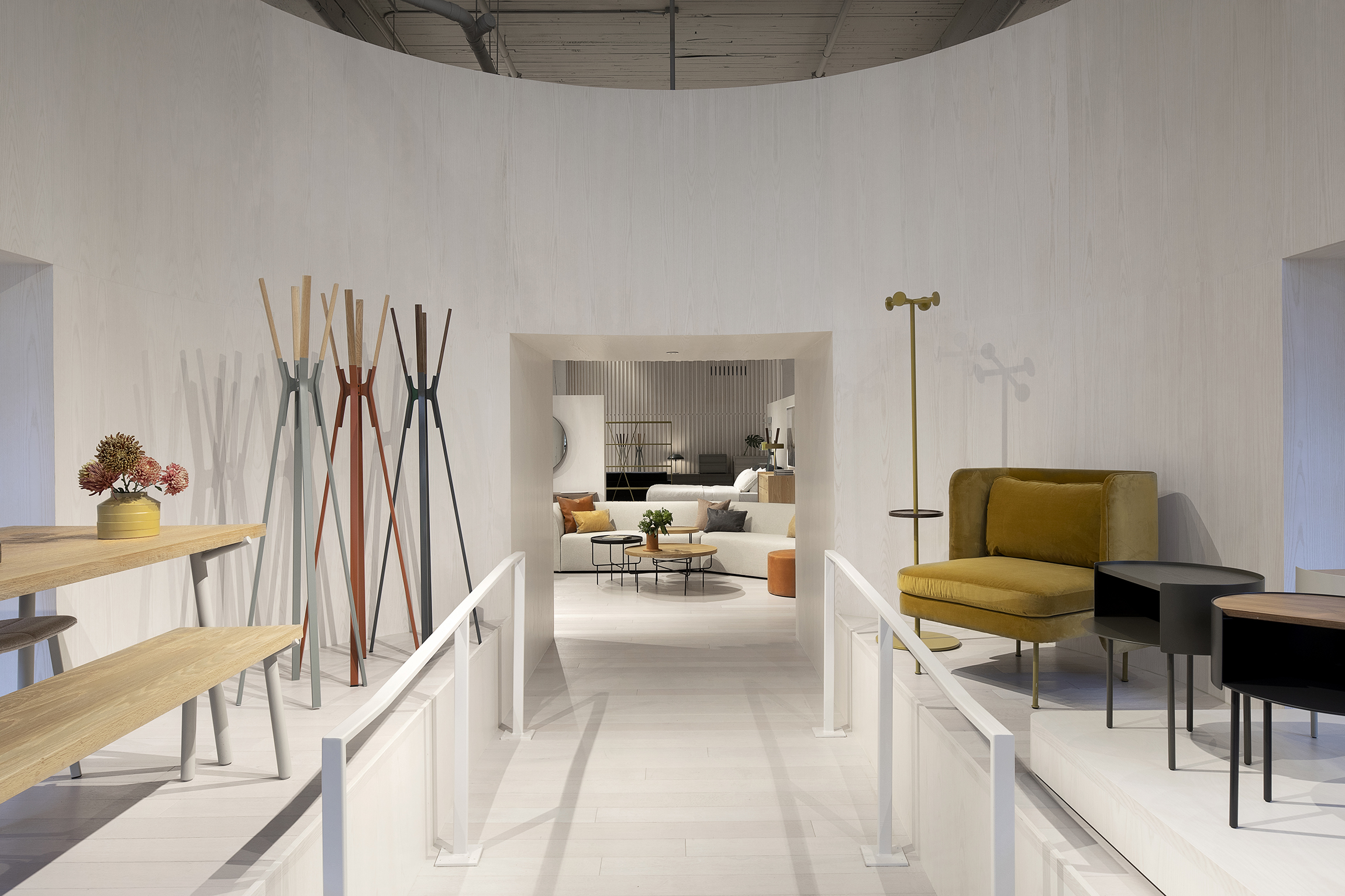
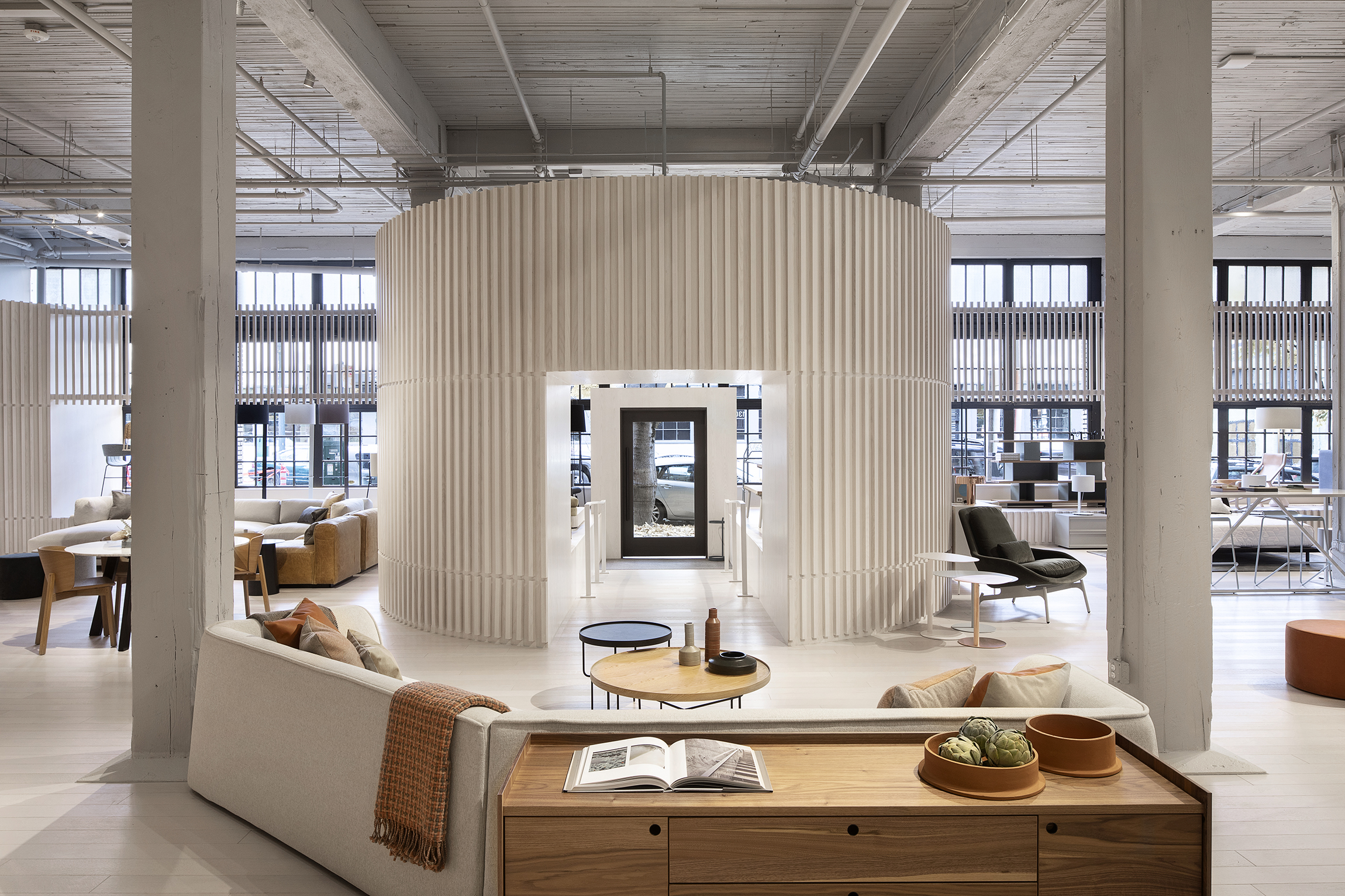
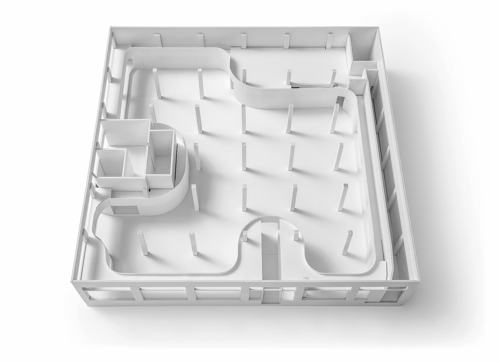
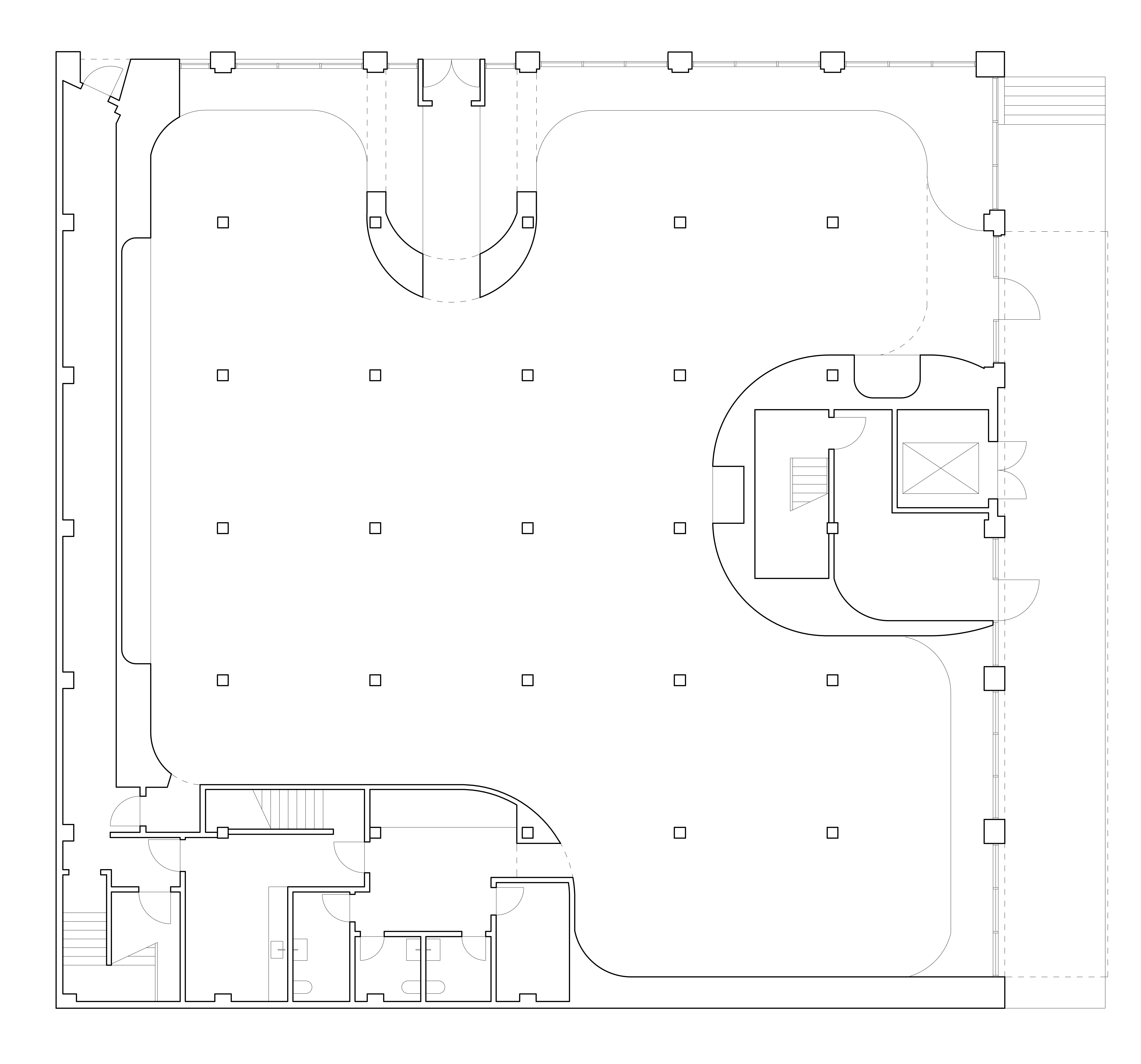

Curved corners act formally and performatively to differentiate new and old, encouraging movement between the two. Discretely scaled zones flow into each other, as the curves lead visitors around the perimeters of the space.


On the exterior of the building a new canopy brings a discrete set of storefronts, loading areas, and elevator access bays into a singular form and organization.

Process




Drawings / Diagrams
